

Getting Started
Create IdenfyUISettingsV2
Create an instance of the IdenfyUISettingsV2 class:Update IdenfySettingsV2
Which Approach Should You Use?
Customization Options
Customization with IdenfyUISettingsV2
Camera OnBoarding View
Joined Country and Document Selection
Since SDK version 9.0.0, this setting is enabled by default and the country and document selection views are joined into one.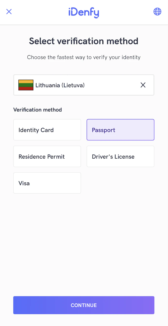
Language Selection
Mismatch Tags Alert Visibility
Bottom Sheet Dialogs
Since SDK version 9.1.0, this setting is enabled by default, it present dialogs as bottom sheets instead of centered alerts for iDenfy custom dialogsDocument Camera Rectangle Visibility
Since some documents are non-regular size, you can hide the camera rectangle. This way the whole screen is dedicated to document capturing. The rectangle can be hidden for all document types:Adding Instructions in Camera Session
The SDK provides informative instructions during the verification session. They can provide valuable information for the user and help tackle common issues: bad lighting, wrong document side, etc. Instructions can be customized by changing all UI elements or even using your MP4 video files. Instructions are configured by your backend settings and can be overridden with the SDK settings. Using IdenfyInstructionsEnum dialog: Using IdenfyInstructionsEnum none: Enable instructions in IdenfyUISettingsV2:Applying SDK-Wide Color Changes
If color and asset changes are the only requirement, they can be easily customized by changing the main colors.
1. Override color names in your app module.
Create either a new
idenfy_colors.xml or add the defined colors to your project.
2. Make color changes:
Customization with styles.xml or colors.xml
Every screen in the SDK uses different styles.xml which covers all UI elements visible on that screen. By overriding styles or colors in your app target, you can change the look of the SDK to match your brand guidelines.
You can access the styles.xml and colors.xml here.
Customization with Overriding Layouts of SDK
All layouts in the SDK are structured so that it is easy to override all components to match your brand identity. Requirements for overriding layouts:- Do not remove IDs of components — this will maintain project stability and avoid runtime crashes.
- Keep the same layout names — if layout names are changed, the SDK layouts will not be overridden.
Customization by Providing Your Own Implementations of Jetpack Compose Composables
For more advanced customization (fonts, layout structure, etc.), you can provide your own composable implementations. 1. Create an instance of IdenfyComposableViews UseIdenfyComposeViewBuilder to create an instance of IdenfyComposableViews with your custom composables, which conform to an interface provided by the SDK:
IdenfyComposeViewBuilder provides a data class with all required resources (images, videos, button actions, etc.) to fulfil the view. Pass this class to your composable:
IdenfyComposeBases, which you can use to provide ONLY your customized separate composables. These composables will be composed by the SDK, preserving the intended layout guidelines while displaying your own customized composables.
A minimal example showing how to use IdenfyComposeBases to provide custom composables:
The snippet above is intentionally minimal. Download the sample app for a full working example that covers all composable slots, state handling, and button actions.
IdenfyComposeBases class.
Example of the Customization Flow
Download the sample app. Check theIdenfyApplication class, where you will find IdenfyComposeViewBuilder with all the composables composed by IdenfyComposeBases.
Customization by Providing a Custom Verification Results View
To fully customize your verification results waiting view, you can pass your own fragment. You can then control when and after which additional steps you want to retry the verification session: 1. Create a class that implements IdenfyInProcessIdentificationResultsHandler
Pass an instance of your created class to the
1. Create a class that implements IdenfyInProcessIdentificationResultsHandler
Pass an instance of your created class to the setIdenfyCallBackHandlerAfterSDKCloses() method of IdenfyCallbackController:
onIdenfyFlowFinished() method of your IdenfyInProcessIdentificationResultsDelegate implementation:
IdenfyFlowSettings:
IdenfyInProcessIdentificationResultsHandler implementation has an onIdentificationStatusReceived() method that returns an IdenfyIdentificationResultStatus. When IdenfyIdentificationStatus is FINISHED, call the static continueFlow() method of IdenfyCallbackController:
IdenfyIdentificationResultStatus contains all information about the current state of verification results, which you can use to fully customize your views:
Liveness Customization
The SDK provides additional liveness customization.1. Creating IdenfyLivenessUIHelper
2.1 Applying Regular Settings
If you only need color, text, or width customization, you can use properties from theIdenfyLivenessUISettings class:
2.2 Applying Full Customization
If you require more changes, you can directly set the livenessCustomUISettings property inIdenfyLivenessUISettings with your instance of the FaceTecCustomization class:
This will override all other set properties of the IdenfyLivenessUISettings class.